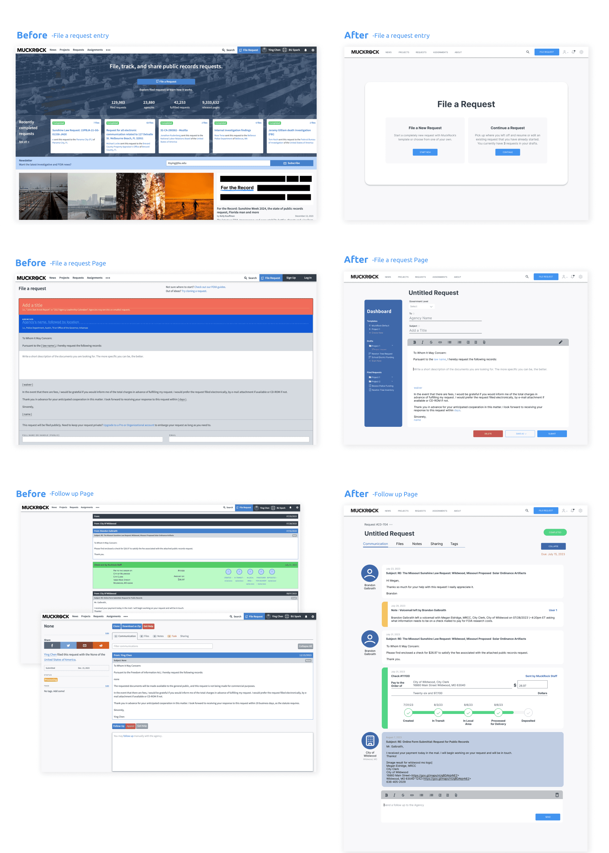
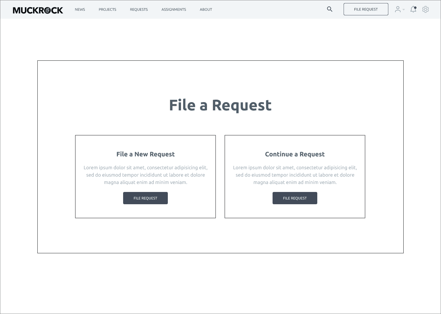
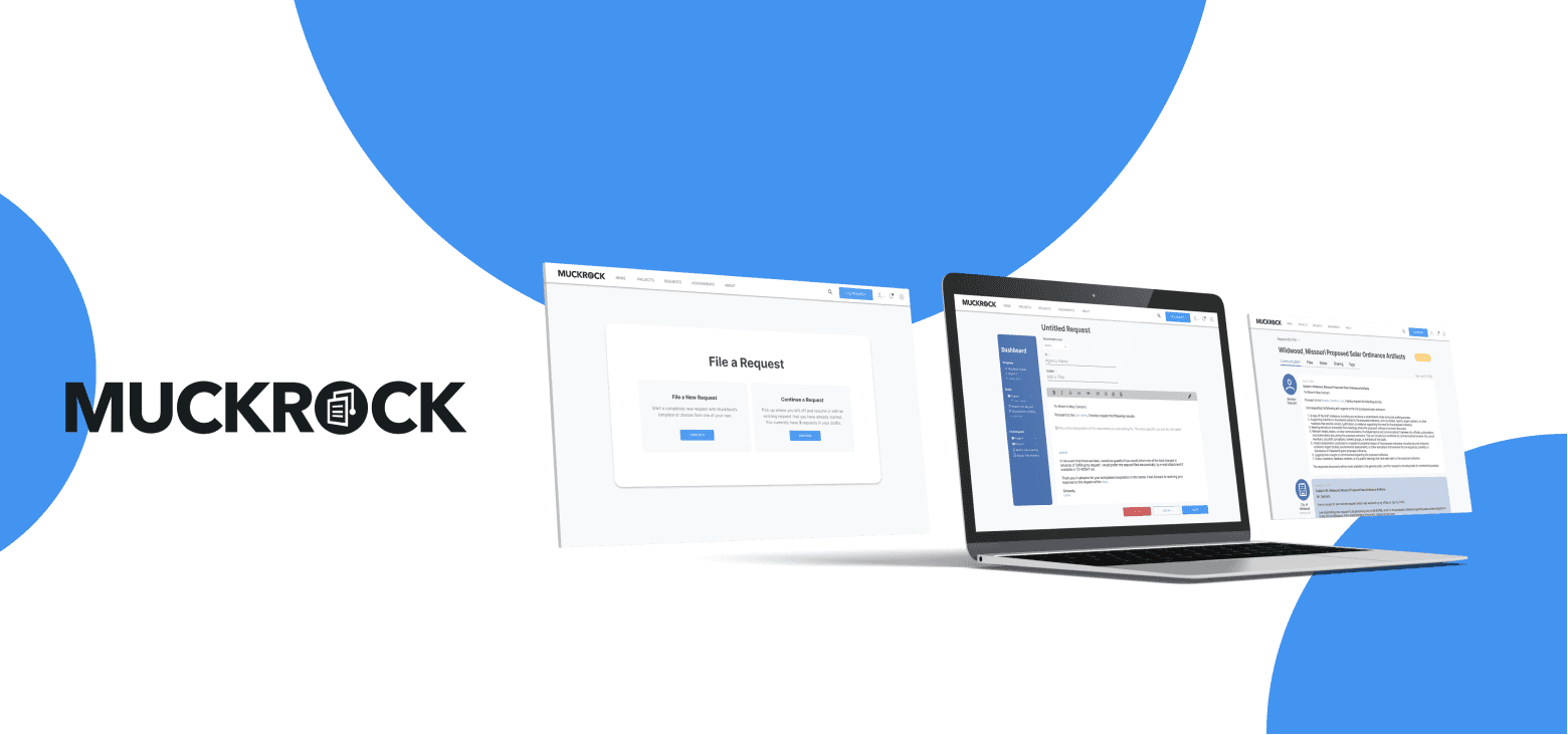
Muckrock is a non-profit organization that aims to promote public records transparency. Its primary users are journalists who can file requests with various agencies. We were tasked with redesigning the page where users can file a request.

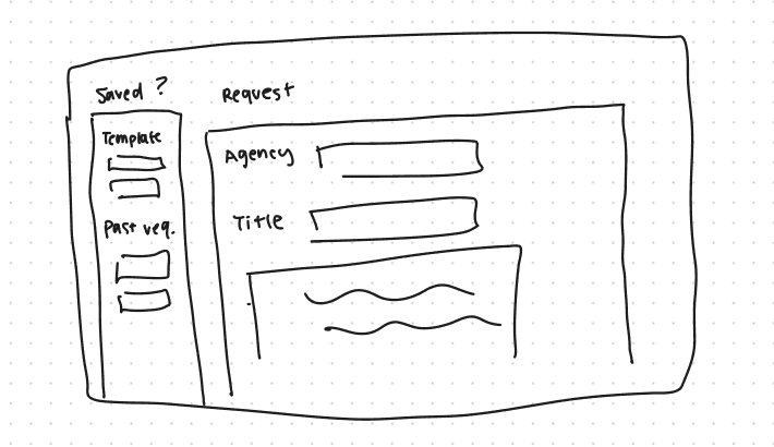
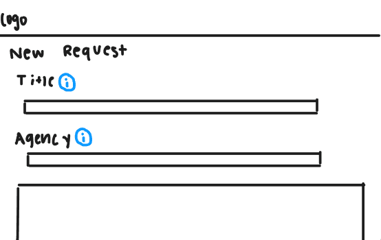
Ideation-easy as drafting an email
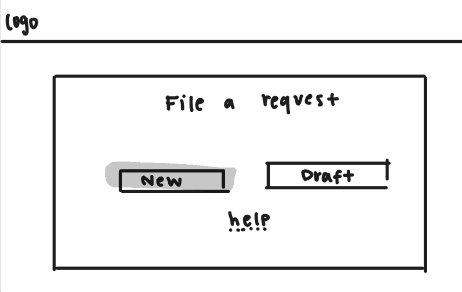
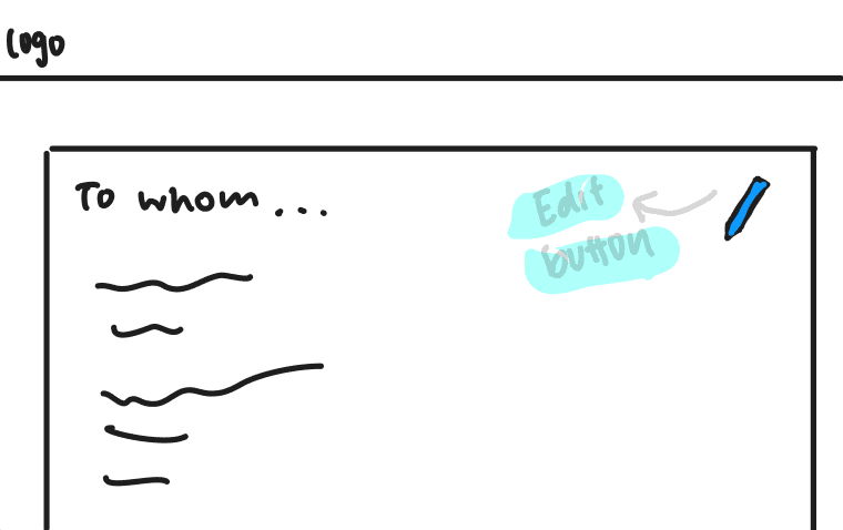
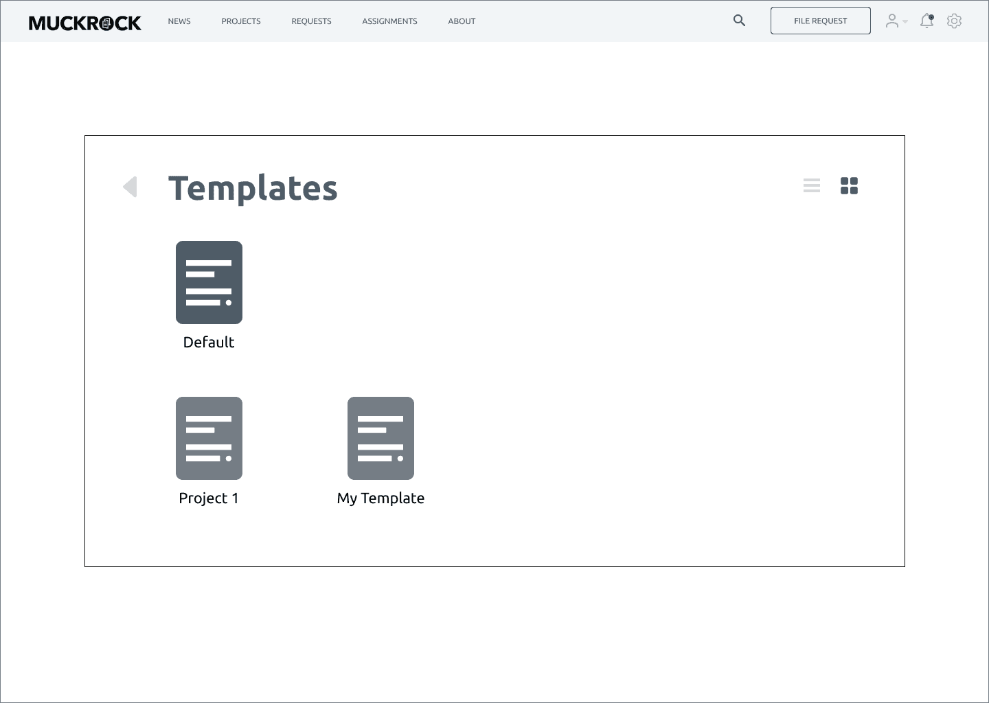
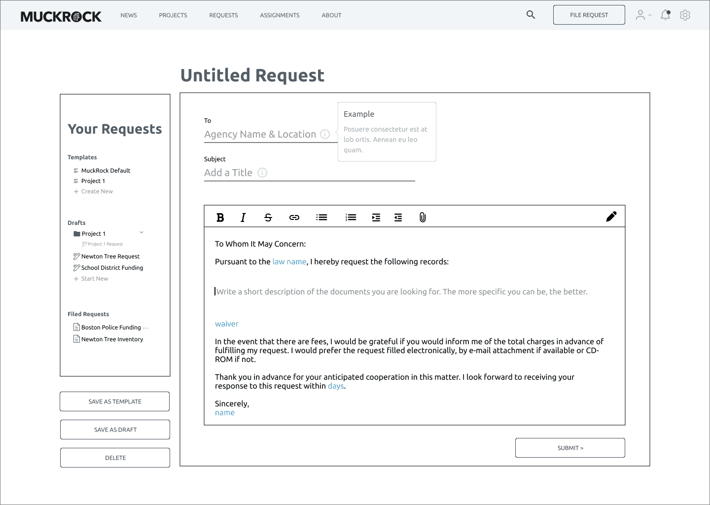
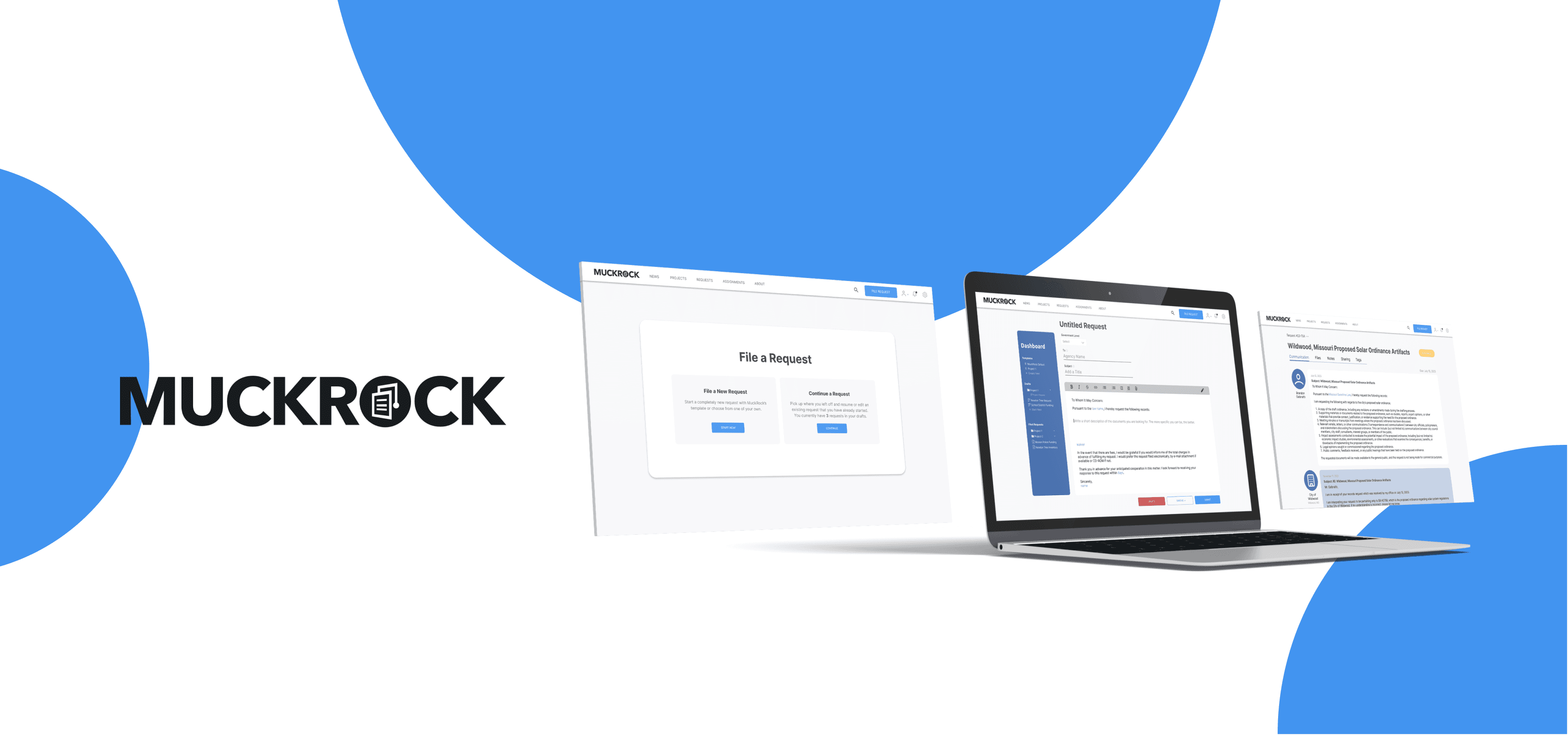
I reorganized the request form and presented it in an email writing format. I also designed a dashboard that includes templates, projects, and past requests. It provides a clear overview, making it easier to navigate and bringing familiarity.
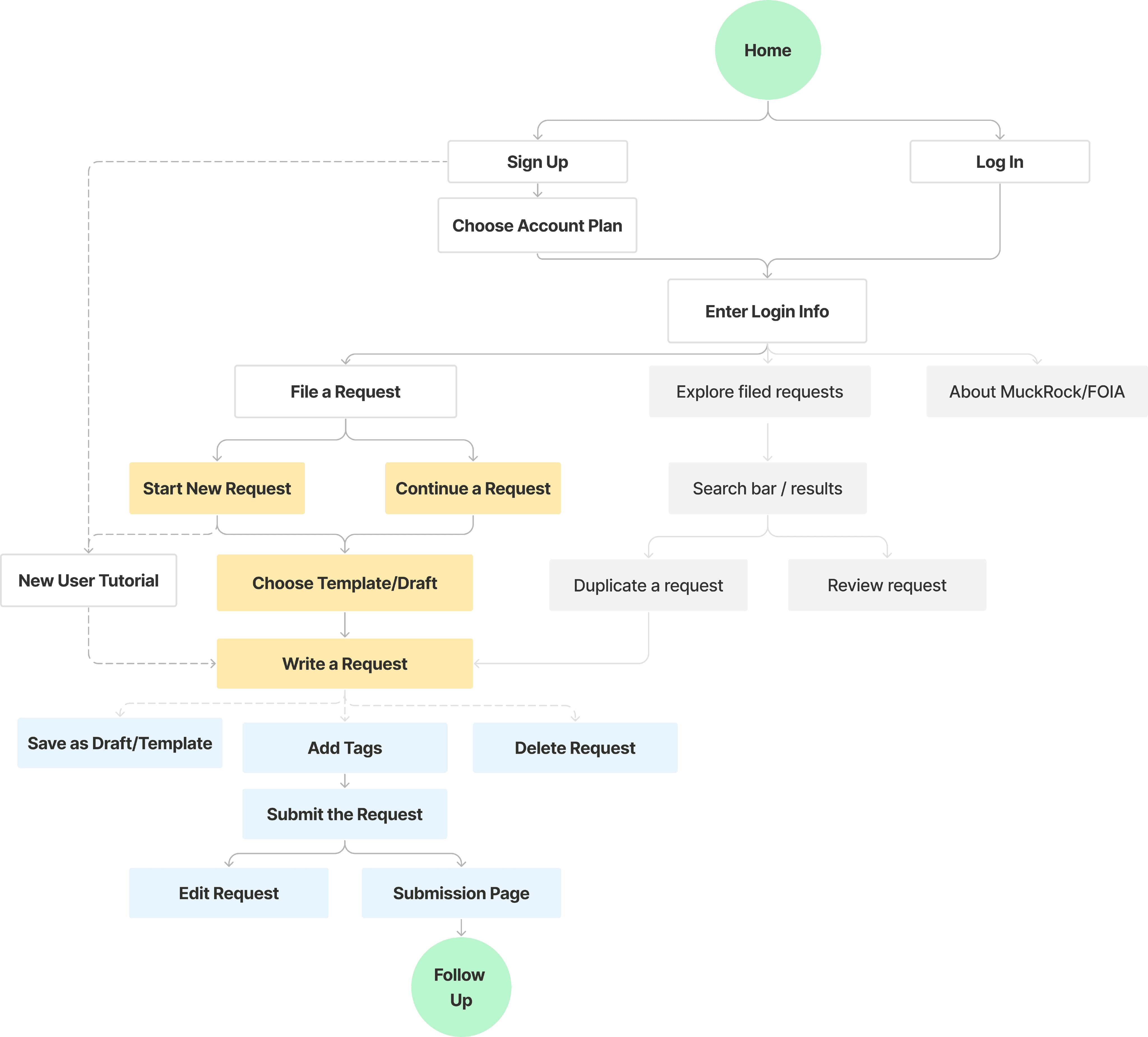
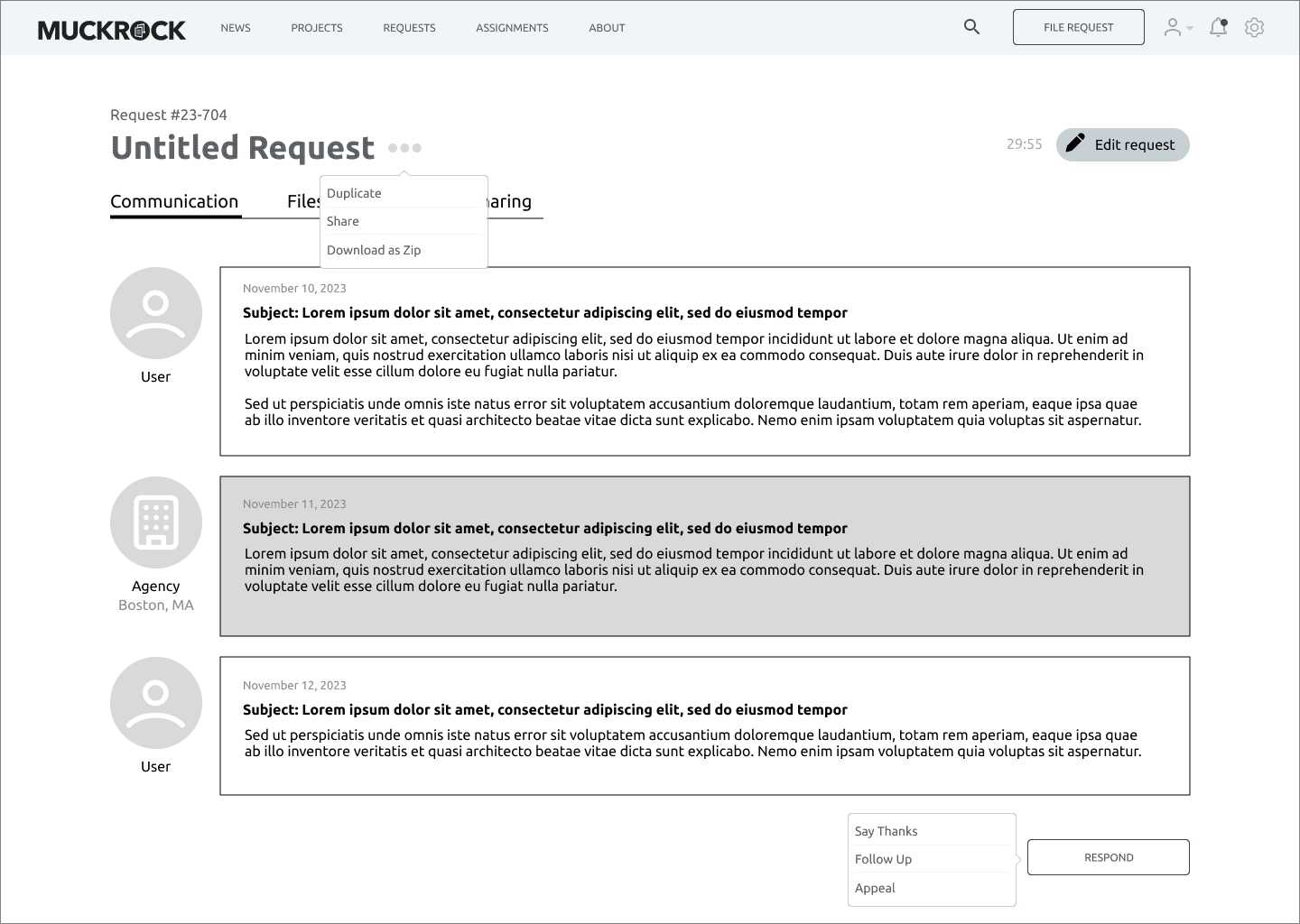
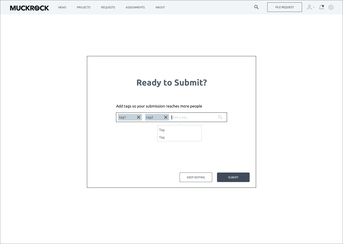
To streamline the process, I categorized functions into hamburgers or embedded them as small steps. By removing redundant sections and adding icons, the restructured "Communication" page becomes more intuitive.
We conducted four rounds of user testing with existing users. We developed a user testing plan, designed several tasks, observed and recorded users' thoughts and reactions, and solicited feedback. The users provided us with very positive feedback, and we implemented their advice into the design.
It was my first time conducting detailed user research and working for a real client. From valuable insights I gained from users, I captured key points of redesign and came up with improvement ideas. From the usability test, I realized the importance of paying attention to details to enhance the user experience. This motivated me to create more equitable and considerate designs for my users.
